Who Came Up With The Iconic Chicago White Sox Look?
By Jesse Dukes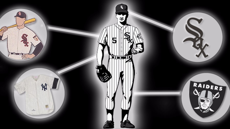
Who Came Up With The Iconic Chicago White Sox Look?
By Jesse DukesThe current Chicago White Sox baseball cap — the black hat with the white-and-silver-trimmed diagonal S-O-X across the front — is well known outside the city, particularly in hip-hop culture. Case in point: the film Straight Outta Compton.
The 2015 biopic about the rap group N.W.A. begins with a drug deal gone bad. The character of Eazy-E avoids being robbed at gunpoint by escaping onto Los Angeles rooftops. All throughout that scene, he’s wearing a White Sox hat.
But, as baseball nerds and purists pointed out, Eazy-E is wearing the wrong White Sox hat. The scene takes place in 1986, but the actor playing the rapper sports the current White Sox hat. That hat in the movie didn’t exist back in 1986 — it was unveiled during the 1990 season.
Our questioner, Chris, read an article about the anachronism and found it fascinating. He’s not a big baseball fan — but he enjoys observing the intense rivalry between Cubs and White Sox fans — and he’s interested in design.

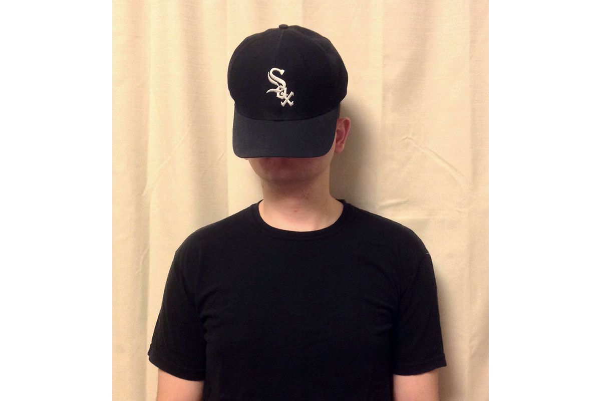
Baseball fans who are old enough might remember when the current White Sox hat was unveiled in the early 1990s. It was a big hit. But Chris, who is only 24, says he always assumed the diagonal S-O-X logo had its origin in the early years of baseball.
“I thought it was a logo that might have been from the classic age of baseball, maybe pre 1950,” he says.
So Chris asked Curious City: Who came up with the design that features the diagonal Old English script?
Now, Chris isn’t entirely mistaken to think the hat comes from an earlier era. It turns out the 1990s White Sox hat and uniform were inspired by the uniform from 1948.
The White Sox, who have often struggled to achieve the same popularity (and stadium attendance) as their crosstown rivals, have actually changed their uniforms 13 times since 1900, second only to the Cleveland Indians. But consider this: The current uniform design has been in place with only minor variations for 27 years, a franchise record. The story of how the logo was first designed in 1948, redesigned by multiple owners and eventually revived, tells us a lot about how a baseball team manages its relationship with its fan base and its brand as fashions and fan’s expectations change.
An unlikely vice president gives the White Sox a new look
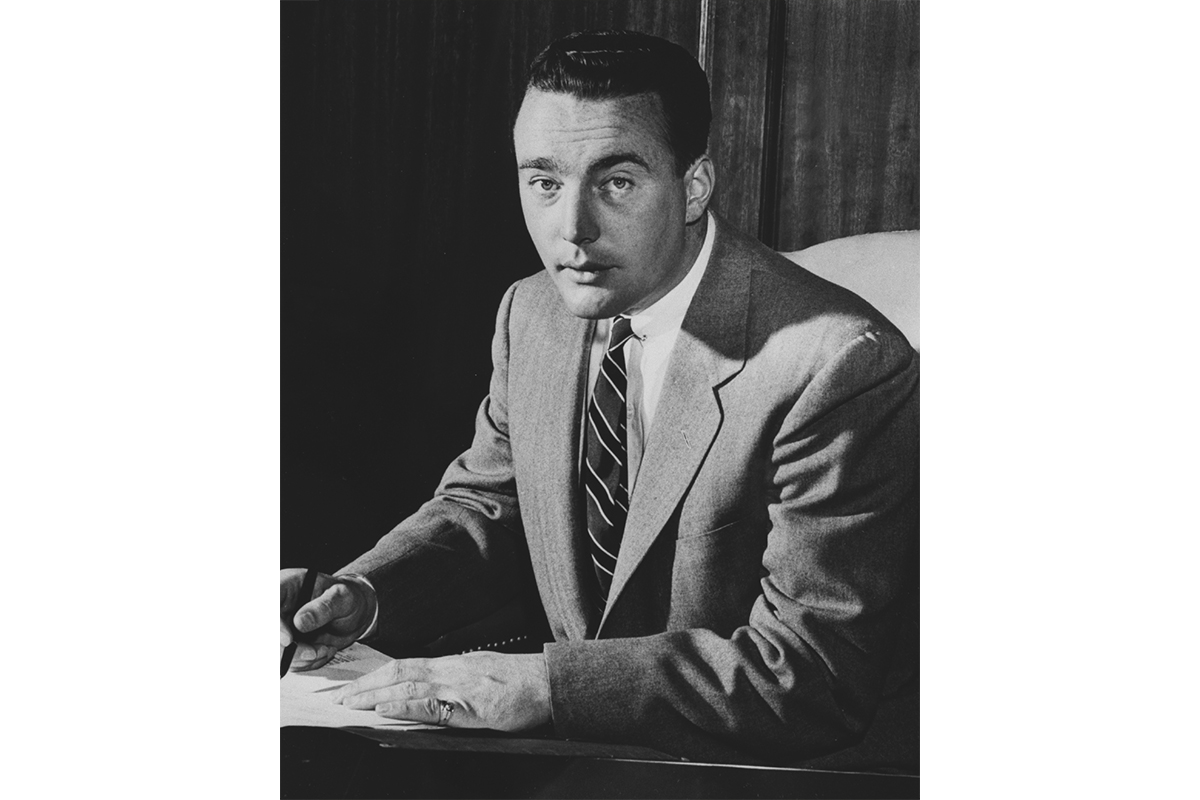
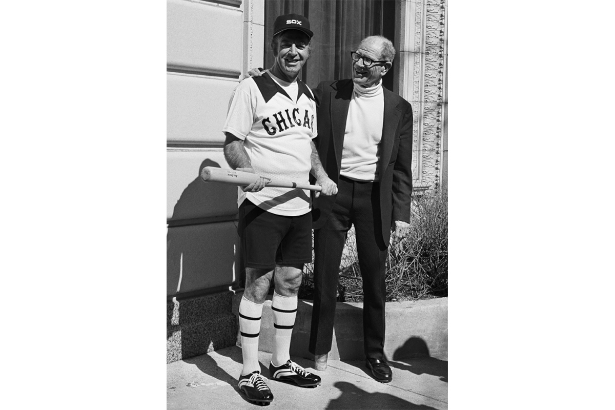
The story of the iconic S-O-X logo design begins in 1948 when Chuck Comiskey, the grandson of White Sox founding owner Charles Comiskey, was appointed vice president of operations by his mother, Grace Comiskey. Chuck Comiskey was an unlikely executive. He was only 22 when he took over the team and had just one year of experience working for a minor league baseball team.
“Enormous responsibility was put upon him, to take a bad ball club that finished last and to do something with it,” says Rich Lindberg, a White Sox historian who interviewed Comiskey in the early 1980s. In that interview, Comiskey admitted he was in over his head, but he told Lindberg, “If I couldn’t make the White Sox win, at least I would try to make them look like winners.”
The New York Yankees were famous then, as now, for consistently winning baseball games. Comiskey borrowed the Yankees organizational structure for the Sox minor leagues and coaching, and according to Lindberg, “He copied the appearance of the Yankees: their dignified pinstripes, the conservative button down look.”
The 1948 Yankees uniform (which, is almost exactly the same as their current uniform) featured dark pinstripes on white jerseys, a dark blue hat, with a white, N-Y written in Old English style font.
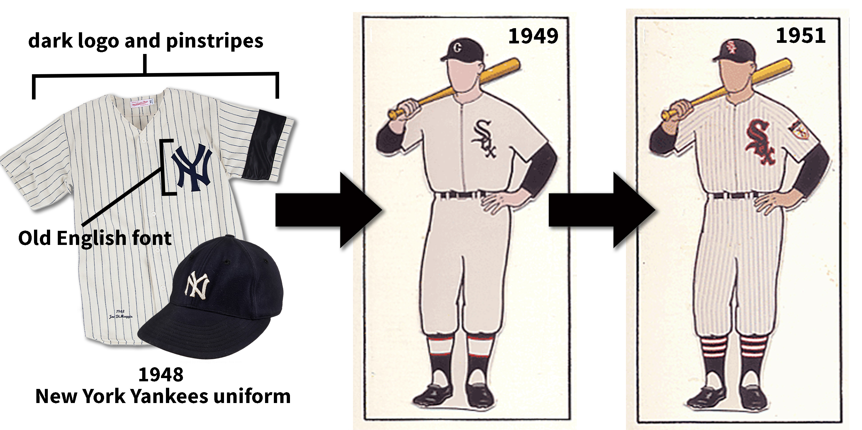
The home uniform Chuck Comiskey designed over the course of three years included black pinstripes on off-white jerseys and a diagonal S-O-X on the chest. In fact, the uniform’s design is quite similar to today’s home uniforms, except the S-O-X font is on the hat is different, and the word “SOX” included a red highlight on both the hat and jersey.
Lindberg says these uniforms were a big hit with the fans. Around the same time, the team Comiskey put together turned out to be pretty good at winning.
“This uniform became emblematic of the White Sox franchise and the success they enjoyed through 17 consecutive winning seasons,” says Lindberg.
Comiskey became a part-owner of the team in the 1950s, but by 1959 was ousted from the organization after a complicated series of legal and financial struggles over who would control the franchise.
However, Lindberg says, “I think in many ways, he is the real unsung hero of White Sox history.”
Changing times, changing uniforms
The White Sox kept Comiskey’s uniform design for nearly three decades, although they did experiment with a few variations designed to appeal to changing fashions. In 1962, the pinstripes and hat went from black to blue, but the diagonal S-O-X remained. In 1971, the colors shifted to a “candy stripe” look, with red pinstripes and a red hat.
However, after a disappointing 1975 season, then-owner Bill Veeck decided to abandon the Old English S-O-X logo. While he was the White Sox owner in the 1970s, Veeck was famous for themed promotional nights like “Disco Demolition Night.” He also installed the so-called “Exploding Scoreboard”. His branding strategy favored attention-getting stunts and, according to Lindberg, he didn’t like the White Sox 1971 red and white uniforms.
“Veeck decided he would design his own uniform,” Lindberg says. “But what emerged was a shocking variation on tradition.”
If Chuck Comiskey’s 1951 uniforms suggested dignity, conservatism, and tradition, Veeck’s 1976 design suggested scruffy haircuts, gaudy chains, and after-work slow pitch softball. The jerseys were off-white with big floppy collars. The pants were clamdigger length with striped knee-high socks. They even had shorts for hot summer games, something previously unheard of in baseball.
“The Veeck uniforms, in my mind, had no dignity,” Lindberg says. “And they left Sox fans open for ridicule.”
The 1976 uniforms lasted until 1982, when new owner Jerry Reinsdorf allowed fans to vote on a new uniform and hat; a look that developed the nickname “winning ugly.” The Sox unveiled another more conservative look in 1986, which Lindberg says was undistinctive: “It was an OK uniform, but wasn’t hitting the right note and cord with White Sox fans.”
By 1989, the White Sox were again struggling to win games and get people into the ballpark, and for the fourth time in thirteen years, they decided to redesign the uniform.
An ‘open-minded’ campaign brings back a classic look
In 1989, the White Sox hired Rob Gallas as senior vice president of marketing and broadcasting. One of Gallas’ first priorities was a total team rebranding, which would include a new uniform and hat. He was partial to the hat and uniform of the 1950s and 60s.
“I went in with an open mind. I knew I had to do the research. I couldn’t do it based on whatever sentiment I might be bringing to the part,” Gallas says.
So, Gallas led a redesign process involving several of his staff, as well as outside marketing, branding, and design consultants. Gallas hoped the new uniform would be timeless and not subject to shifting fashions the way the last several White Sox uniforms had. In addition to consulting with experts, his staff conducted their own fan surveys.
“My director of marketing, Mike Bucek, took prototypes to parties and got opinions on what the fans liked,” Gallas says. “One thing we learned really quickly is Sox fans really liked the pinstripe uniform of the 1950s and ’60s, and they really liked the Old English style S-O-X logo of the same period.”
Gallas decided to bring back the diagonal Old English S-O-X. But, he was also aware that the demographic of the fanbase was shifting. The White Sox were always based in Bridgeport, on the South Side, and for much their history were associated with the white ethnic working class neighborhoods in the area like Armor Square, McKinley Park, and Gage Park. But by the 1980s, the South Side had become increasingly African-American and Latino, and while Gallas says they weren’t trying to target any particular demographic, “We wanted a uniform that would appeal to everybody.”
That meant making the design feel both modern and timeless.
“We talked to more designers who told us silver and black were going to be the hot colors of the 1990s,” Gallas says. “Turned out they were very correct.”

The uniform the White Sox introduced at the end of the 1990 season drew from tradition: it included the Old English S-O-X and the pinstripes, but it also borrowed (or stole) from the black, white, and silver look of the Los Angeles Raiders football team, a color scheme that was very popular amongst gangster rappers on the West Coast. The hat mirrored the Old English logo on the uniform, and was adopted almost immediately by N.W.A. members Eazy-E, IceCube, and Dr. Dre, who wore the hat in videos for his hit 1992 album, “The Chronic.”
Longtime White Sox fan and Chicago radio personality Mario Smith remembers this: “When [Dr.] Dre started wearing that White Sox hat, everybody started wearing that White Sox hat. Dre wearing that White Sox hat changed the world.”
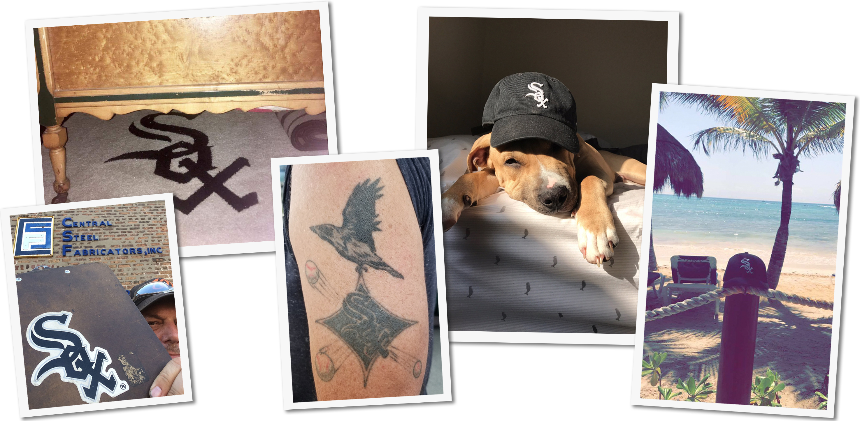
Gallas agrees that the logo and hat became very popular. He says in-stadium merchandise sales increased by nearly 2,000 percent between 1989 and 1991.
“For two straight years, White Sox merchandise accounted for 20 percent of all the major league baseball merchandize sold nationally,” he says. “We were one of 26 teams but we sold one fifth of all the merchandise. My favorite story is the New Era Hat company, which made all the [officially licensed] baseball hats, twice had to shut down and make only White Sox hats for several weeks to meet the demand from customers.”
Most importantly for the White Sox — those new uniforms, combined with a new stadium, and a young, talented team — contributed to a tremendous revival in box office sales. Attendance soared from around a million in 1989 to nearly 3 million the following year, and stayed strong for most of the 1990s.
Lindberg sees the 1990 redesign a little differently than Gallas. As far as he’s concerned, it was a resumption of tradition.
As he puts it, “It was a no brainer, there was no mystery about it.”
Lindberg says the time he spent talking to fans in ballparks or tailgate parties in the 1970s and ’80s made it clear that those who remembered the diagonal S-O-X and the pinstripes wanted those design elements back.
“We breathed a sigh of relief when the pinstripes came back,” Lindberg says. “I don’t think anybody needed to do a marketing study, though I understand the purpose of it, and Rob [Gallas] certainly did a great job recognizing that. But if you put your finger on the pulse of the White Sox fans, the people who take the subway, and who park outside the stadium and do tailgating, this is what they were saying for a number of years.”
For his part, Gallas, is careful to acknowledge the role of the fans love of earlier designs in the 1990 redesign, and stresses (again and again) it was a team effort. But he’s also proud of what he considers to be one of the most successful rebranding campaigns in sports history:
“When somebody walks by me up here in Wisconsin, or Florida in the winter, wearing a [White Sox] hat I resist the temptation to go ‘Hey, that’s my hat.’”
More about our questioner
Chris wanted to remain anonymous for this story. He describes himself as “a neutral Chicago fan who likes a good game of baseball.” He became interested in baseball in college, when he had two roommates, one of whom was a White Sox fan and one who was a Cubs fan. And even though he doesn’t consider himself a White Sox fan per se, he is a fan of the logo and he hopes the Sox stick with it.
“I can see the rationale of a rebranding, but I really like that logo, and I don’t think I’d be comfortable with a new one.”
Jesse Dukes is Curious City’s Audio Producer. You can reach him at jdukes@wbez.org. Special thanks to Kevin Kaufmann and Cheryl Raye Stout for research help.