A slow-mo glimpse of urban sprawl in Chicago
By Elliott Ramos


A slow-mo glimpse of urban sprawl in Chicago
By Elliott RamosBy the time your eyes hit this sentence, you’ve likely encountered the spray of neon colors adorning a black map of Chicago. This is no exercise in design for design’s sake. Instead, it’s a WBEZ data play on this amazing visualization of the city of Portland. It got our juices flowing enough that we put together several views of Chicago data for you to get a look at.
But other than some serious eye-candy, what’s going on here? We’re basically providing a slow-mo glimpse of urban sprawl: how Chicago grew over almost two hundred years, and where it’s currently growing. (If the concept sounds familiar, it’s possibly because we used the same technology utilized by Open City apps to visualize buildings, zoning and demolitions in the Chicago area in a project dubbed Edifice.)
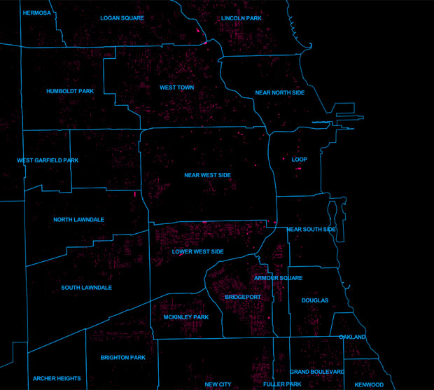
For the map above, we took data from the City of Chicago’s data portal (presumably originating with the Department of Buildings) and combined it with a wild color scheme (thanks again, Portland!). The color-coded display shows where buildings were constructed in Chicago within certain time periods, with white being the most recent. The data appear to be valid between 1850-2012, though you may notice a few notable buildings are missing (e.g., Wrigley Field). Interestingly enough, Soldier Field appears white, meaning the data suggest it’s a recent structure. The entry likely accounts for the field’s new spaceship-like modifications made in 2003.
Below, though, we break out frames to show you before-and-after snapshots during important historical milestones. We’ve by added light blue lines to display boundaries of Chicago community areas so you can keep your bearings from one era to the next.
After the Great Fire
This shows the boom in construction during the 1870s and ’80s. This occured after the Great Chicago Fire.
1920s
There were other booms, especially in the roaring 20s. The South Side, with its meat-packing plants, factories and railyards, made up the industrial backbone of the city:
The Great Depression
There were major declines during the 1930s. As you can see here … not much happening. The Great Depression probably had something to do with that.
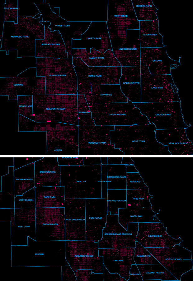
Post-WWII
In the 1950s Chicago expanded westward, especially in Jefferson Park, Norwood Park, West Ridge Ashburn, Garfield Ridge and West Lawn.
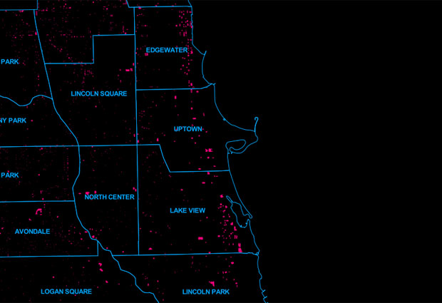
Cooler by the lake in the ’60s
See the line of magenta stretching along the northeast portion of the city? That’s the North Side lakefront’s high-rise boom, which happened in the 1960s. The highrises and other buildings grew in Edgewater, Uptown, the Near North Side and Lakeview. The expansion along the lake continued well into the ’70s, with scarce development happening elsewhere in the city. The 1980s began to the rise of Chicago’s downtown structures, with moderate growth appearing in Lincoln Park.
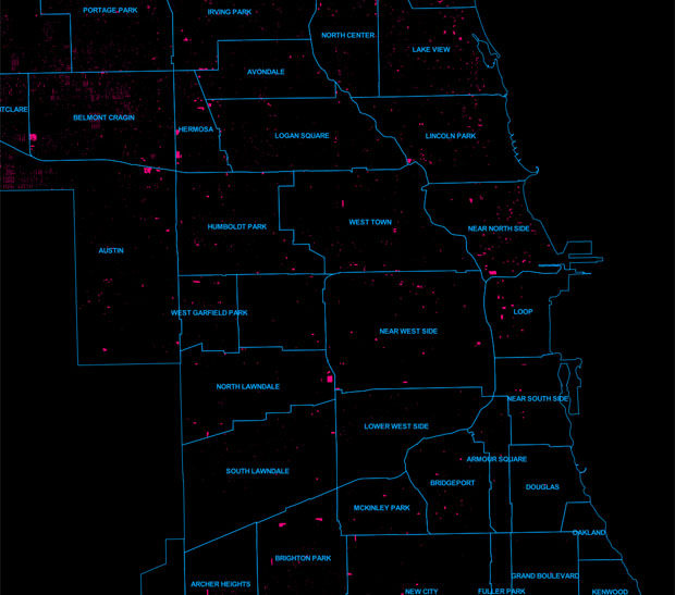
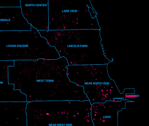
Chicago under Daley the 2nd
The section shows the period between the 1990s and 2012, which saw the largest expansion of new structures since the 1950s.
West Town, Lakeview, Lincoln Park and the Near North Side exploded with growth in the ’90s, during the reign of Mayor Richard M. Daley. If you focus on the neighborhoods of Wicker Park, Bucktown and Lakeview, you’ll recognize blocks that were once dominated by the city’s storied A-frame multi-family houses, but were crowded out or entirely displaced by popular cinderblock condos and 3-flats.
The boom before the recession
The early 2000s saw the expansion of the city’s South and West Loop, a story covered by WBEZ data intern Simran Khosla.
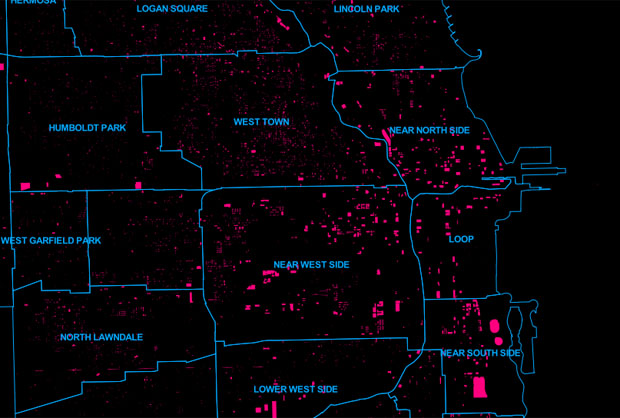
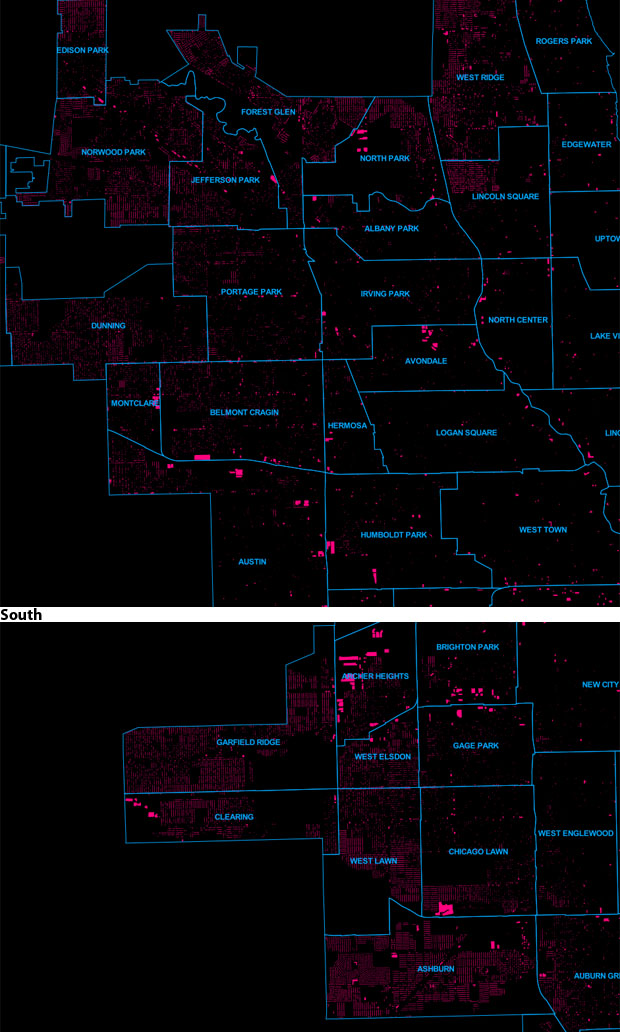
The decline of the South Side
The map also shows that the South Side hasn’t experienced the same growth the North Side has the past 20 years.
Further, and possibly more depressing, is that the amount of abandoned buildings (above) that were demolished and turned into vacant lots are much more apparent on a map, displaying as jagged teeth-like structures when compared to other North Side neighborhoods.
See anything above that should spark a conversation? Please hit us up in the comment section below.
Elliott Ramos is a data reporter and Web producer for WBEZ. Follow him @ChicagoEl.