New Illinois school report cards mean less data
By Linda Lutton
New Illinois school report cards mean less data
By Linda LuttonIllinois education leaders have been touting the state’s new “report cards” for schools, saying the redesigned report cards make it easier for parents to understand how schools are doing, and add information that rounds out the public’s picture of their schools.
But in the week since the report cards have been out, parents, journalists and advocates have noticed that other important Illinois school data—and an interactive web site that made the information accessible—have disappeared. Complaints from schools about the missing data are prompting the state to re-publish the prior web site along with the new report card site, which cost $600,000 and took years to develop.
There are 4,000 schools in Illinois, and for each one, the state collects thousands of bits of data—information about student race, teacher salaries, average class size. Test scores sliced and diced dozens of ways. Altogether, it adds up to millions of little facts about Illinois schools.
And for just over a decade there was a web site called the Illinois Interactive Report Card—formerly at http://iirc.niu.edu—that took all that data and made it understandable to regular people.
“It had an array of tools that allowed you to compare schools and school districts across the state very, very easily,” says George Clowes, senior fellow with the Heartland Institute and former editor of School Reform News. Clowes says it was easy to pick criteria and then see how a particular school or district stacked up.
“It was one of those cases where a picture is worth a thousand, two thousand, three thousand words. You could see very quickly how that district sat and what the picture was statewide.”
But last week, when Illinois switched to a new parent friendly report card—illinoisreportcard.com—the Illinois Interactive Report Card web site and much of the data that fueled it went away.
“I just came to grips with it Friday of last week,” says Rodney Estvan, an advocate for students with disabilities with the organization Access Living. “I spent about four hours trying to search through it. I kept thinking that I wasn’t seeing a link for greater detail. So I kept looking for pulldowns that were not there.”
Estvan says the new site is easy to navigate, but he says he used the old interactive site to help parents.
“I would get questions from parents like, ‘Is this a good school or a bad school for kids with disabilities?’ So I could do a comparison. That is not easily available now. Nor is any of the grade level data. So for example, you can’t see the progression of achievement by grade level and look at where things may be stalling in your school.”
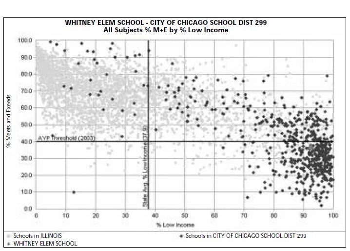
Parents can no longer easily visualize achievement gaps between different racial or income groups at their kids’ schools, nor can they see 10 years of demographic trends like they could before. Also gone are “scatter plots” that allowed users to compare relationships between factors like district spending and test scores.
Chicago mom Jeanne Marie Olson, who works with data and co-founded the Apples2Apples school data project, says the public is losing context. She said the new site is “oversimplified to the point where I as a parent am not finding it as useful as the previous iteration.”
The interactive web site was born at Northern Illinois University in 2001, and existed on floppy disks before that. Since 2003, NIU has had a contract with the state to update the data every year and maintain the web site, which gets about 30,000 hits per month, according to staff at the university.
Beginning around midnight on October 31, the day the state released 2013 school data, visitors to the Illinois Interactive Report Card web site were redirected to the state’s new report card site—which shows just two years of test scores rather than the 10-year trends shown on the interactive site. A number of fields on the new report card site are blank. For instance, users who click on one new measure, the number of middle school students passing Algebra I, get a “Coming in 2014” screen.
“It’s like the web site had a prefrontal lobotomy,” says Clowes. “What a huge loss of an invaluable data analysis tool. Now the IIRC just functions as a robot data presentation tool.”
The state and proponents of the new report card say it was never the intent to take any data or analytical capabilities away. Illinois State Board of Education spokeswoman Mary Fergus says producing the new report card was a major effort—one mandated by law—that required collecting and posting new measures of school progress, including survey data about schools and things like course offerings.
Fergus says after spending time, energy and money on the new site, the state wanted parents to use it. That’s why the old interactive site was taken down.
But Fergus acknowledged the state has heard grumbling.
“In the last week or so we’ve heard from school staff that said they wanted access to that material, so we’re going to get it back on the site within the week,” Fergus said Thursday.
Fergus said the state has received “overwhelmingly positive comments” from people about the new report card, which also includes a two-page “at a glance” summary of a school’s performance and environment that can be printed out. “It is just a matter of due diligence and prioritizing the data we want up there. There’s a lot of new great data on this new report card site. Sure, there’s a couple minor glitches, but we are definitely on the road to a much more understandable report card that everyone can use—and really the end result will be how people use this data to improve their local schools.”
Staff at Northern Illinois University confirm there is significantly less data available on the new web site. They say the intent was to add data and capabilities going forward.
But meanwhile, Fergus says the state will revive the Illinois Interactive Report Card next week—which will now be called “Classic” Illinois Interactive Report Card. The state will add a link to it from the new report card site. Fergus says there will be no extra cost to run the two sites.
For some, there’s a bigger philosophical question at play here, about whether the state is trying to guide the public to a particular conclusion about its schools. One parent complained on Twitter that the new site doesn’t give what used to be basic information about a high school’s performance: average ACT scores. (If you’re wondering why not, it’s because the state wants you to think differently about ACT scores these days. The new site only reports how many kids at each school earned a score of 21 or better on the exam.)
The state says it still publishes average ACT scores on a separate site.
Robin Steans, executive director of Advance Illinois and one of the biggest proponents of a new report card, says she always understood the report card would be adding information, not replacing data. She says the state’s goal in presenting school data should be to strike a balance.
“You certainly want the ability to navigate, use and compare information based on your own interests and research objectives,” says Steans. “I think there is also value in presenting information that is more likely to be immediately meaningful to people who don’t have a lot of experience interacting with what can be very overwhelming and very confusing and very arcane information.”
The paper version of school report cards had grown in some cases to more than 20 pages of mostly test score data.
Chicago parent Marc Sims says he will welcome the return of the “classic” interactive report card site next week, which he’d become accustomed to using. Sims still lives in the South Side home where he grew up and tries to follow the progress of his neighborhood grammar school. He says if the data is laid out in an understandable way, there’s no reason parents can’t look at lots of it. “I want to know how the school is doing this year—compared to last year, compared to five years, compared to 10 years ago. If you’ve got 30 years, go right ahead! Give me 30 years of graphs if you can lay it out nicely to see how the school has done.”